


14. INCORPORATE "BATTENBURG" PATTERN?


Emergency vehicle visual identification can serve two purposes:
-
To identify and give a message;
-
To be so visible that it won’t cause an additional incident.
With the new micro-prismatic reflective sheeting, you can meet both of them. Many studies have proven that a highly visible “broken” pattern catches more oncoming driver’s attention than continuous lines.
Proof point:
DOT conspicuity tape for semi-trailers is a broken pattern of red and white, and not just all red or all white.
Chevrons on the rear of Emergency vehicles are a broken pattern of red & another color, in an inverted V shape.
Even new strobe light bars don’t just flash on and off, but attract more attention with a “non-constant” pattern of changing flashing rate!
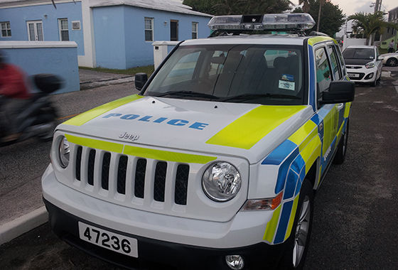
European “Battenburg” is an option being considered in North America because many cities and departments have understood that increased visibility enhances driver safety.
This is often done the “easy” way by digital printing or screen-printing over glass bead reflective sheeting (3M 680 style)
Adding “inks”, even if translucent, reduces the luminous intensity of the reflective markings at night, so if this is the option you want, it is advantageous to at least start using sheeting with the highest possible luminous intensity available.
To attain the highest reflective result, it is preferable to use “un-inked” conspicuity grade products and build your own pattern. Squares of any size of products like Reflexite V-98 butted together like a checkerboard not only single out an emergency vehicle from a great distance, but produce the maximum luminous intensity at night, often visible up to 8X the distance of regular screen/digital printed glass bead markings.


Here is a description of a “real” Battenburg marking.
The Battenburg specification states that ‘colours as close to square as possible tend to be the most conspicuous’. It has also been observed that “fluorescent paints possess greater visual fields than their ordinary counterparts.” The same researcher also noted that blocks tended to be more conspicuous the larger and the squarer in shape they were and that surrounding the blocks with contrasting colour was a major factor in increasing the effectiveness of the stimulus in being conspicuous.”


The ideal Battenburg layout for Police sedans and wagons. Note the 1.5 rows of side pattern with just a few blocks of colour. There is also thin yellow contour striping over the roof arch and on the pillars;
-
Visible throughout the day and night and capable of being seen from a minimum viewing distance of 500 metres from on-coming road users.
-
Clearly identifiable as a Police car.
Another major concern was that the new design should assist in [community] high visibility policing to reassure the public and enhance the potential deterrent benefits of proactive traffic patrol activity. Battenburg had to be acceptable to at least 75% of the staff using it. It was indeed fortunate that the Battenburg blue Police colour was identical to the blue Sillitoe colour already in use across the UK.
The large square or slightly rectangular fluorescent yellow blocks make up the visibility element of Battenburg. Every second block was made blue because it is the last colour to be visualised before human vision changes from colour to monochromatic shades of gray as darkness falls.
The Half Battenberg uses only the top row of the Full Battenburg scheme.
The simple pattern of just a few large alternating blocks of colour enhances the physical conspicuity of the scheme when viewed amid the complex urban clutter. The Full Battenburg design is prone to delivering camouflage effects when surrounded by busy street scenes that tend to break up the solid blocks in the design. The Half Battenburg is more effective in city environments where vehicle speeds are slower. The emphasis is placed on rapid recognition at distances under 200 metres rather than maximum visibility. The Half Battenburg scheme also allows more text and signage to be placed on vehicle than the full scheme. It is also much simpler for sign writers to affix the half pattern to vehicles as the few coloured panels don’t have to be intricately die-cut to fit the European body curves often found on modern cars.